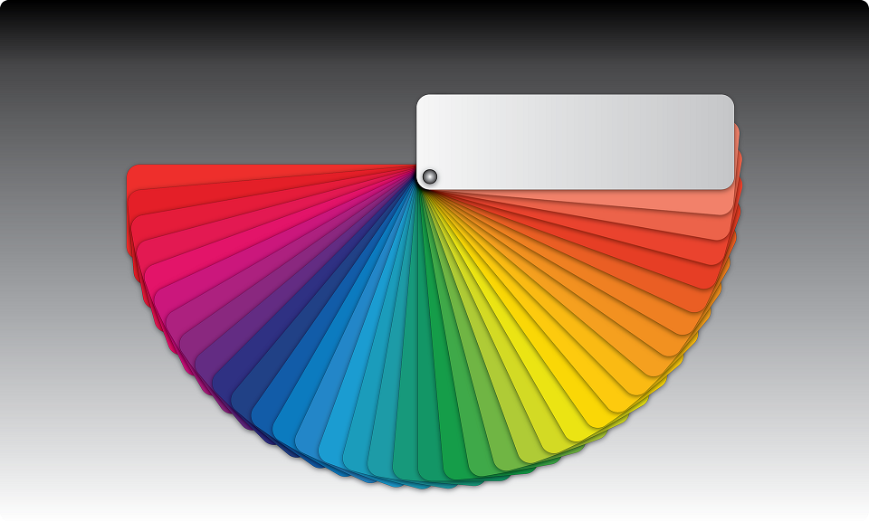
One of the most important things that you can consider when it comes to the décor of your house is what types of colors you are going to choose. Choosing the right color can be hard or it can be a lot of fun. We know that it can be overwhelming for some people, so we have made an easy to use guide for knowing the different types of colors as well as the color schemes that you can use in your home to make things a lot easier for you.
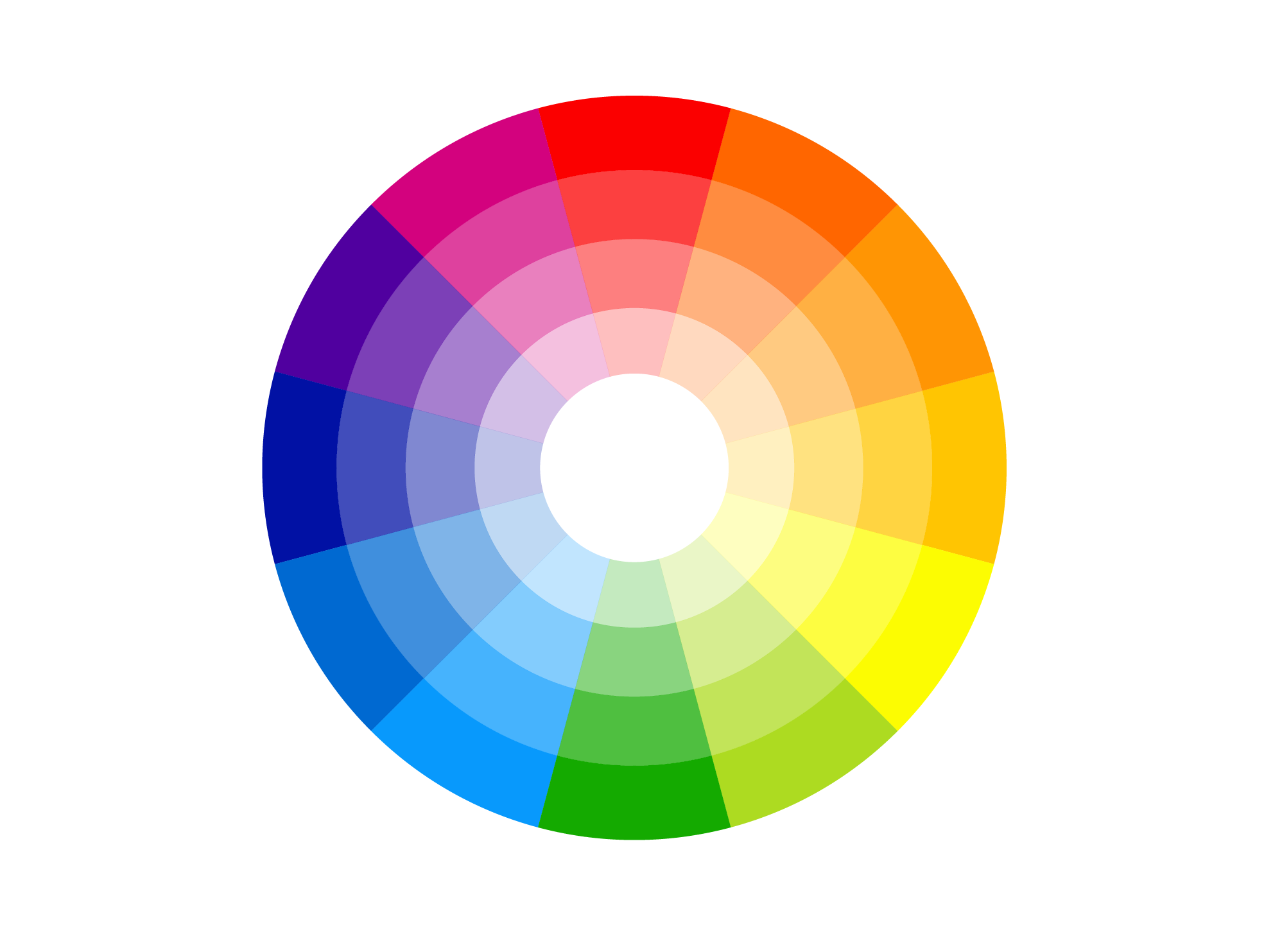
Understanding the Color Wheel’s Colors
The first thing that you want to do is make sure you understand the different color terms and the colors to which they refer. So below are the color groups on a color wheel and what colors are in those color groups.
Primary Colors
Primary colors are the ones that you learned about when you were in nursery school. The three primary colors are:
- Blue
- Red
- Yellow
All other colors come from these colors, whether they are pastels or combination secondary colors.
Secondary Colors
The secondary colors are the ones that come out when your primary colors merge. These colors are:
- Green
- Purple
- Orange
- Tertiary Colors
Tertiary colors are the ones that are right in between two colors. These are colors such as:
- Blue-green
- Blue-purple
- Green-yellow
- Orange-yellow
- Red-orange
- Violet-red
- Cool Colors
Cool colors are colors such as greens, purples and blues. These are all passive colors, and they’ll recede into your background. They often make your room look bigger. These types of colors are great for:
- Bedrooms
- Home offices
- Any other spaces that require calm and peace
Greens are often rejuvenating, so putting some houseplants around the room can give you some color while maintaining the balance of a room.
Warm Colors
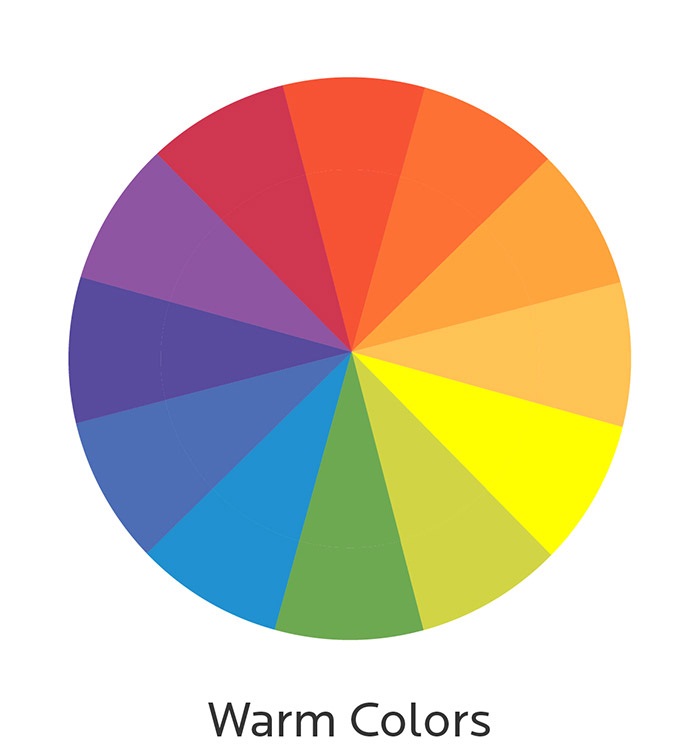
The warm colors are oranges, reds and yellows and they invigorate your living space. These colors are active, and they look like they’re moving towards you and they transform your space into an intimate setting. They also can be very distracting, so you want to use them in the creative spaces such as kitchens and playrooms. You can also use them for your home office you want to keep it from being really dreary while at the same time retain productivity.
Neutrals and Whites
Even though they aren’t thought to be in the typical color wheel, you shouldn’t overlook how importance of neutrals and whites when you’re decorating your home. Whites help with promoting a feeling of openness when you use it a lot. When you use whites for accents, they provide a crisp frame for showcasing other colors. For your wall colors, use muted, soft whites for preventing eyestrain that bright whites can cause when light reflects off of them.
Neutrals are things like soft tans and creams that will bridge your rooms together. Not distracting and cooperative, neutrals are good with blending with your other colors so that schemes are kept cohesive. It helps with blending things together.
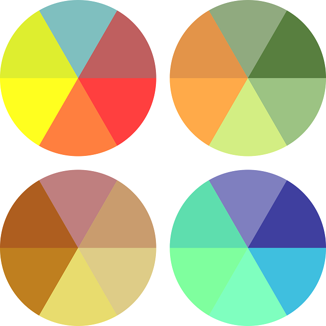
Different Color Schemes
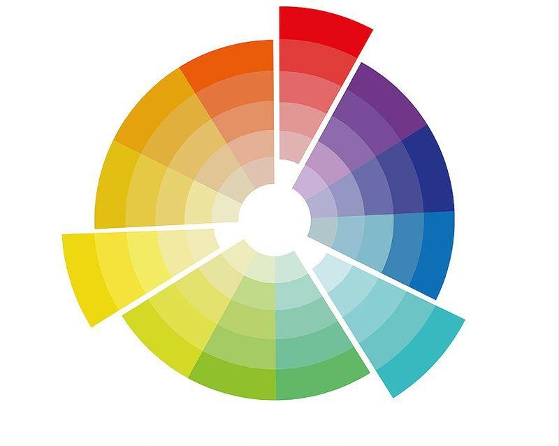
Since you know now more about the colors in a color wheel, there are a lot of ways that you can approach selecting your color scheme. There are five different methods that you can use for using color in your home.
Monochromatic – You may think that a color scheme with a single color is boring. But this is not true. Using different shades from the same family of colors will create a color scheme that’s harmonious, that’s simple to use and that’s easy to look at.
Analogous – When you want to use analogous or similar colors in your color scheme, start out by choosing the color you like best on your color wheel. Then you want to look at the colors that are on the sides of that color. If there’s only one that you like one of the colors, then look at the color on that color’s other side. When you find 3-5 consecutive colors on the wheel which are appealing, you’ve figured out the color scheme. These kinds of colors are much richer than the monochromatic colors, but they’re just as easy to use.
Complementary – This is similar to choosing the analogous scheme. However, rather than looking at the colors that are next to your favorite, look at the one that is opposite your favorite. These are the two colors that are complementary. One of them is going to be warm while the other’s cool. You should keep your favorite color as your dominant hue and use the other for accenting it. even though this is a bit more difficult when it comes to balance, this color scheme creates a dynamic effect.
Split Complementary – With this color scheme, you want to select the color that you like best. Then you want to figure out those two colors that are next to the complementary color. Using those three colors is going to be a bit less rigid than when you use a complementary color scheme, yet it’s going to have the same vibrancy. Split complementary will work best when you have a dominant warm color.
Triadic – When you want to use this approach, you are going to choose three colors which are spaced out equally on your color wheel. This color scheme presents contrasting colors that look gorgeous without having the dramatic effect of complementary color schemes. This is the one that’s often used more than other types.
Now that you understand the colors and what types of color schemes are available to you, you’re ready to choose the colors and the color schemes that are going to be in your house. Have fun with figuring things out, and look for some fun additions to your furniture and décor, like a nice area rug, a vase or a gorgeous quilt. You can find many beautiful and stylish quilts at BeddingBeauty.com. They’re all handmade and one of a kind, so explore their inventory and find the one that’s best for you.